Tuesday 30 November 2010

Artist Research

I decided to do some research about artists that I like, in the acoustic genre. Artists include Taylor Swift, James Morrison, Jason Mraz and Colbie Caillat. The links to the artists' websites are below:


I've found some images of these artists that may inspire me when I take my shots for my magazine:

Thursday 25 November 2010

Searching the web

Whilst reading around the subject, I found a useful article which I found interesting:

Editorial Profile


Risk Assessment

I'm planning to do a photoshoot on a frosty, clear day, in a field by a river. I'm required to create a risk assessment form, highlighting the risks and solutions that may come with my chosen place. This is shown below:

Advantages and Disadvantages


Advantages: Using a questionnaire to collect data has many advantages. Large numbers of people can be contacted quickly and easily, meaning that a lot of useful information can be collected efficiently. It is relatively easy to make and doesn't take too long - once finished, the respondent does most of the work! Another advantage is that it's easy to standardise, as everyone answers the same question. Questionnaires also can be used to explore sensitive material, as they can be anonymous and completed in private.

Disadvantages: There are however some disadvantages of questionnaires. For example, respondents can misunderstand questions or deliberately invalidate the questionnaire, resulting in having an unreliable set of data. It's difficult to ascertain the truth of respondents' answers, as people could be influenced by their friends etc. Often people only give limited depth of response, even with open questions, so it can be hard to explore complex issues and opinions. Questionnaires can be of limited use if a poor sample is chosen. Also, self-selecting samples can contaminate data, it should be ensured a wide variety of people (age, gender) is chosen.

Overall, questionnaires clearly have their strengths and weaknesses. By sending out a questionnaire to my target audience, I'm hoping to gain useful data that will give me the information I need to produce a successful magazine.

Tuesday 23 November 2010

Questionnaire

I've designed a questionnaire to send out to my target audience of teenage females. There are a mixture of closed and open questions so that the person can give their full opinion, giving me more useful information. I included a few potential fonts for my masthead which I like, as I want to find out what other people prefer. Also, there are a few front pages of existing music magazines for people to choose their favourite, as this will give me an idea of the colours/ layout my target audience prefers. The results will influence the decisions I make in the future making of my magazine.

Monday 22 November 2010

Masthead Ideas

I came up with a few names for my magazine before experimenting with different fonts, using 'Aspire' as a template.
I experimented further with fonts by looking at the website 'Dafont' and downloading various fonts that I liked.

I'm keen on the name 'Aspire' as it looks visually good with these fonts and also it would fit my music magazine well considering the fact that it is aimed at aspiring/ambitious artists.

Friday 19 November 2010

Understanding Audience

When doing some research, I found this information about how to understand your audience. I should consider these questions when making my media product:
  • Analysis: Who are they?
  • Understanding: What is their understanding of the subject?
  • Demographics: What is their age, gender, background, profession, and so forth.
  • Interest: Why are they interested in your topic?
  • Environment: Where will they be reading, and what are the conditions?
  • Needs: What do they need from you?
  • Customization: Do you need to adjust things for any special needs or interests of specific audience segments?
  • Expectations: What does your audience expect? Do they already have some questions they want you to answer?

Wednesday 17 November 2010

Audience Theories

1. The Hypodermic Needle Theory

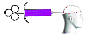
Dating from the 1920s, this theory was the first attempt to explain how mass audiences might react to mass media. As you can see from the diagram, this theory suggests that audiences passively receive the information transmitted   via a media text, without any attempt on their part to process or challenge the data. Governments had just discovered the power of advertising to communicate a message, and produced propaganda to try and sway populaces to their way of thinking. Basically, the Hypodermic Needle Theory suggests that the information from a text passes into the mass consciouness of the audience unmediated, ie the experience, intelligence and opinion of an individual are not relevant to the reception of the text. This theory suggests that, as an audience, we are manipulated by the creators of media texts, and that our behaviour and thinking might be easily changed by media-makers.

2. Two-Step Flow

As the mass media became an essential part of life in societies around the world and did NOT reduce populations to a mass of unthinking drones, a more sophisticated explanation was sought. Paul Lazarsfeld, Bernard Berelson, and Hazel Gaudet analysed the voters' decision-making processes during a 1940 presidential election campaign and published their results in a paper called The People's Choice. Their findings suggested that the information does not flow directly from the text into the minds of its audience unmediated but is filtered through "opinion leaders" who then communicate it to their less active associates, over whom they have influence. The audience then mediate the information received directly from the media with the ideas and thoughts expressed by the opinion leaders, thus being influenced not by a direct process, but by a two step flow. This diminished the power of the media in the eyes of researchers, and caused them to conclude that social factors were also important in the way in which audiences interpreted texts.

3. Uses & Gratifications

Throughout time, it became increasingly apparent to media theorists that audiences made choices about what they did when consuming texts. Far from being a passive mass, audiences were made up of individuals who actively consumed texts for different reasons and in different ways.

In 1970, Halloran said, "We must get away from the habit of thinking in terms of what the media do to people and substitute for it the idea of what people do with the media." In other words, the consumer now has a say in what they want from the media.

C. Wright Mill decided the four functions of the media for the audience are:
  • To give individuals identity
  • To give people aspiration
  • To give people instruction
  • To give people a form of escapism

Researchers Blumler and Katz expanded this theory and published their own in 1974, stating that individuals might choose and use a text for the following purposes (ie uses and gratifications):
  • Diversion - escape from everyday problems and routine.
  • Personal Relationships - using the media for emotional and other interaction, eg) substituting soap operas for family life
  • Personal Identity - finding yourself reflected in texts, learning behaviour and values from texts
  • Surveillance - Information which could be useful for living eg) weather reports, financial news, holiday bargains

4. Reception Theory

Extending the concept of an active audience still further, in the 1980s and 1990s a lot of work was done on the way individuals received and interpreted a text, and how their individual circumstances (gender, class, age, ethnicity) affected their reading. This work was based on Stuart Hall's encoding/decoding model of the relationship between text and audience - the text is encoded by the producer, and decoded by the reader, and there may be major differences between two different readings of the same code. However, by using recognised codes and conventions, and by drawing upon audience expectations relating to aspects such as genre and use of stars, the producers can position the audience and thus create a certain amount of agreement on what the code means. This is known as a preferred reading.

When considering these theories, I will make sure I use recognised codes and conventions in my magazine to grab my audience's attention. I know now that the codes I use will be interpreted differently, so I am expecting a mixture of opinions when my product is completed. I will also make sure I get audience feedback throughout the process so that I can give my target audience a product that they want.

Monday 15 November 2010

Target Audience

I've created a customer profile to show my magazine's target audience. I want it to appeal to teenagers, primarily females, who are passionate about music. This would include not only those who enjoy listening to acoustic artists, but also keen musicians who aspire to being successful artists themselves.

Looking at an Existing Magazine Cover

I decided to look at an existing magazine that relates in some way to an acoustic genre. Although Rolling Stone isn’t an acoustic magazine, the cover star, Taylor Swift, is an acoustic artist and this particular issue features her on the front page. I like the simplicity of this cover, with a plain background and a striking image which takes up most of the space. Taylor Swift is pictured with a guitar, representing the fact that she is an established singer-songwriter. I also like the layout, with the cover lines on the right hand side and the main feature taking up more space on the other side of the page. The artist’s name is enlarged which grabs the audience’s attention. The font and colour work well with the image and looks effective on the page. I think the posture of the artist is a little awkward, as if it’s been purposely staged. For my image, I’d like to create a more natural feel. Overall, I’m keen on this front page and will use it as inspiration for my magazine cover.


School Magazine

For the preliminary task of my coursework I had to produce the front page of a new school/college magazine, featuring a photograph of a student in medium close-up plus some appropriately laid-out text and a masthead. I began by taking the relevant photos around school before creating the page in Adobe Photoshop.

Overall I think my magazine cover was a success and I managed to capture the codes and conventions of a magazine effectively. This is because the masthead is bold and eye-catching, and the magazine uses a medium close-up of the main subject, similar to a real magazine. I think the variety of fonts (the cover lines) on the page would appeal to the target audience (school students), as they make the page look more interesting and are appropriate to the different articles.

I tried to make the colour scheme fit with the logo in the top right hand corner of the page, using blue, red and pale yellow. I think the blue works well, however as I made the logo quite transparent, the red colour is almost too pale and doesn't fit very well with the background image. I would probably change this if I had more time. Initially I made the image black and white, but came to the conclusion that this made the page look dull and boring, which wouldn't appeal to a younger audience so I decided that it looked better in colour.

I used a transparency tool to make the image fade out at the top which I think looks effective. However, with the plain white, I think the masthead looks quite plain, especially with the font used. If I was to improve it, I would change the font to make it appear more striking. Also, when taking the photo, I think it would have been better to capture the main subject with a simple background so the text could easily stand out.

Thursday 11 November 2010

Acoustic Music Genre Ideas

I brainstormed a few ideas around the genre 'acoustic' music, as this is the style of music I'd like to focus on. I found a few images of artists who I think fit into this genre and who appeal to a similar audience I'm aiming my magazine at. This has made me think about what I want my magazine to look like and I'd like the images in particular to have a natural feel to them, eg. lighting, style, pose, setting etc.

Wednesday 10 November 2010

Evaluating Music Magazine Deconstructions

After looking at a variety of magazines with different layouts and styles, I have come to realise what visually appeals to me and what doesn't. I think a bold masthead and a striking image should be the two main areas of focus, as they say a lot about the magazine. I particularly like a muted colour palette, with only a few bright colours highlighting the key features, as it is easy on the eye and too many colours make the page look messy and cluttered. I also think less is more, especially when thinking about the cover lines. Too much text on the page can detract from the image, so it's important to have the right balance. I think the magazines with the bolder mastheads stood out more, so I need to make my masthead striking in order to engage the audience. NME and Q in particular caught my attention because of the use of colour in the masthead. Bright colours such as red and purple definitely make the masthead more eye-catching. My favourite contents page was 'Vibe' because of it's different layout and simple background. Many magazines try and fit too much into the contents page making it seem overloaded with information. However a plain background, clear text and prominent image make the page simple but effective. For a double page spread, I like the idea of having a quote from the text enlarged so it takes up quite a lot of the space, as this acts as a lure encouraging people to read the article.

Wednesday 3 November 2010

Analysing Music Magazines

I analysed various front covers, contents pages and double page spreads of different music magazines, including Kerrang, Rolling Stone, NME, Vibe and Q, in order to help me plan the pages for my magazine.