
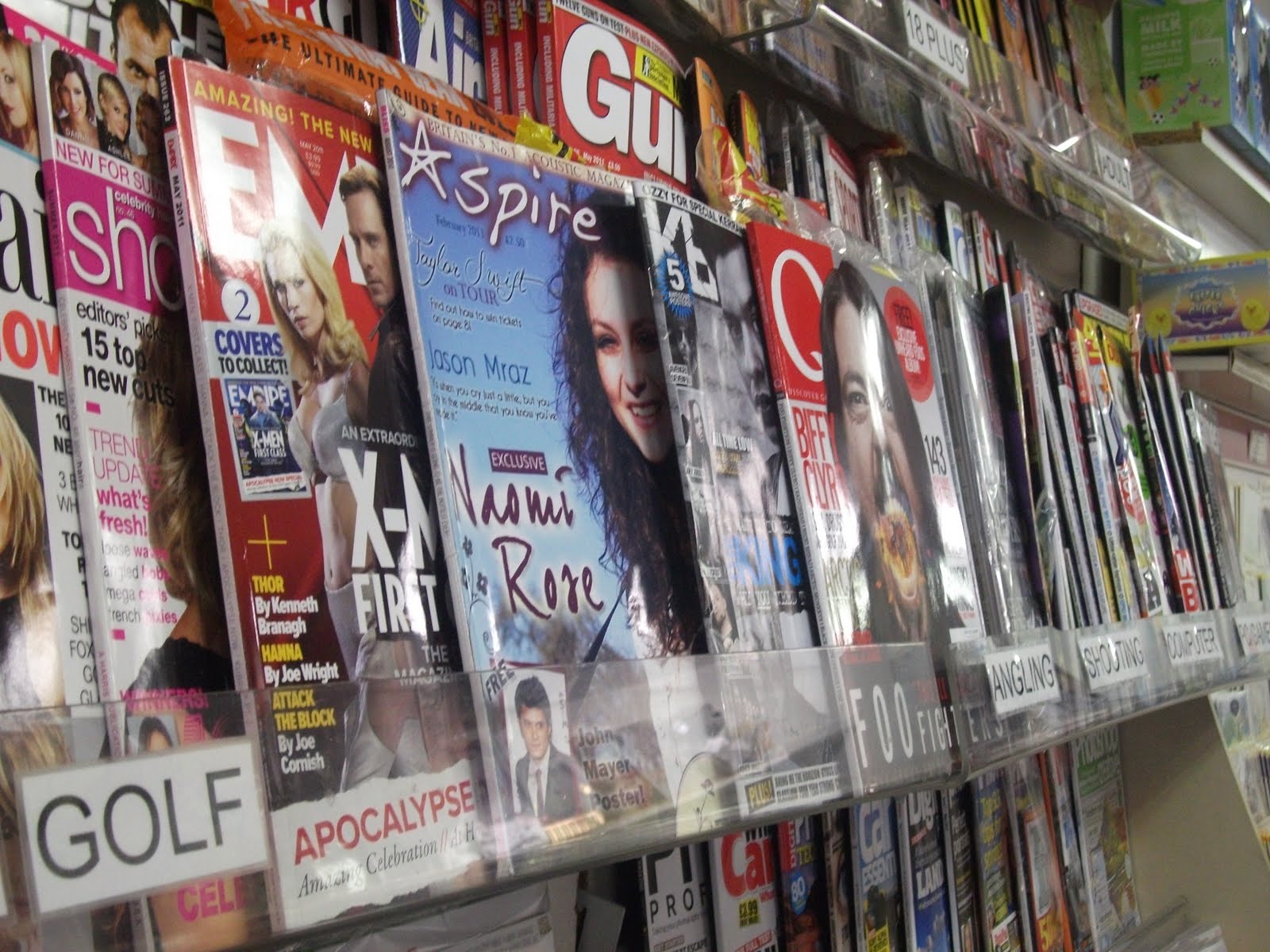
In order to test my magazine's marketability, I placed my front cover amongst other music magazines. For my magazine to be successful, it had to stand out to lure readers in. I think my magazine cover is eye catching, particularly because of the bold blue background colour and the creative fonts. My magazine has a unique house style which also makes it attention grabbing. The 'free' poster is bold enough to capture the audience's attention, acting as a successful lure. Overall, I'm pleased with how my product looks in comparison to established magazines.
Emma, as promised, a provisional grading of your coursework and a couple of things to maybe change. Remember that this grade is subject to standardisation and could change.
ReplyDeletePlanning and research (18 out of 20). Emma has shown a high level of skill in her deconstructions of relevant materials through the project. She has identified key conventions and shown that she understands why they are used and how to replicate them. She has demonstrated a clear understanding of key media concepts and has used these to shape her work. Market research was meticulously conducted and analysed. Emma's organisation has been faultless; she is an excellent time manager.
Construction (55 out of 60) Emma has shown herself to have a considerable natural eye for design; coupled with a tireless desire to perfect everything down to the smallest detail. She has created a relatively niche product demonstrating a clear understanding of conventions and an awareness of what her T.A desire. House style is excellent and the finish is professional as the 'product placement' exercise evidences. One slight criticism however, based on shelf placement would be that perhaps her main image should really appear more to the left side of the page; otherwise excellent work.
Evaluation (17 out of 20). A thorough and reflective piece of work that shows a very clear progression from ancillary task to finished product and a steep learning curve. Emma has demonstrated considerable skill in DTP which she has developed throughout the course. She has displayed the information using a number of different formats.
Oh, by the way your photo buscket stuff is ok, but the slideshare not working well and clunky? How come yours aren't imbedded into your blog like the others and you have to navigate away from your page? It's a bit annoying - can we rectify this?
ReplyDelete