Tuesday, 5 April 2011

How effective is the combination of your main product and ancillary texts?


Since creating my school magazine cover, my knowledge of using Photoshop has increased considerably. For example, I now know how to make my magazine more effective, by adding drop shadows and outer glows. I also learnt how to select parts of photos using the quick selection tool, which was useful when cutting out the flowers to put on my front cover, contents page and DPS. The layout of my magazine has also improved since my school magazine, as I have considered the ‘golden line’ – something which I didn’t know about before. I have used much more visual fonts that are attention-grabbing whereas, in my school magazine, the fonts are quite plain and boring. Overall my understanding of the software has improved greatly throughout the making of my music magazine, helping me achieve a professional looking product. 

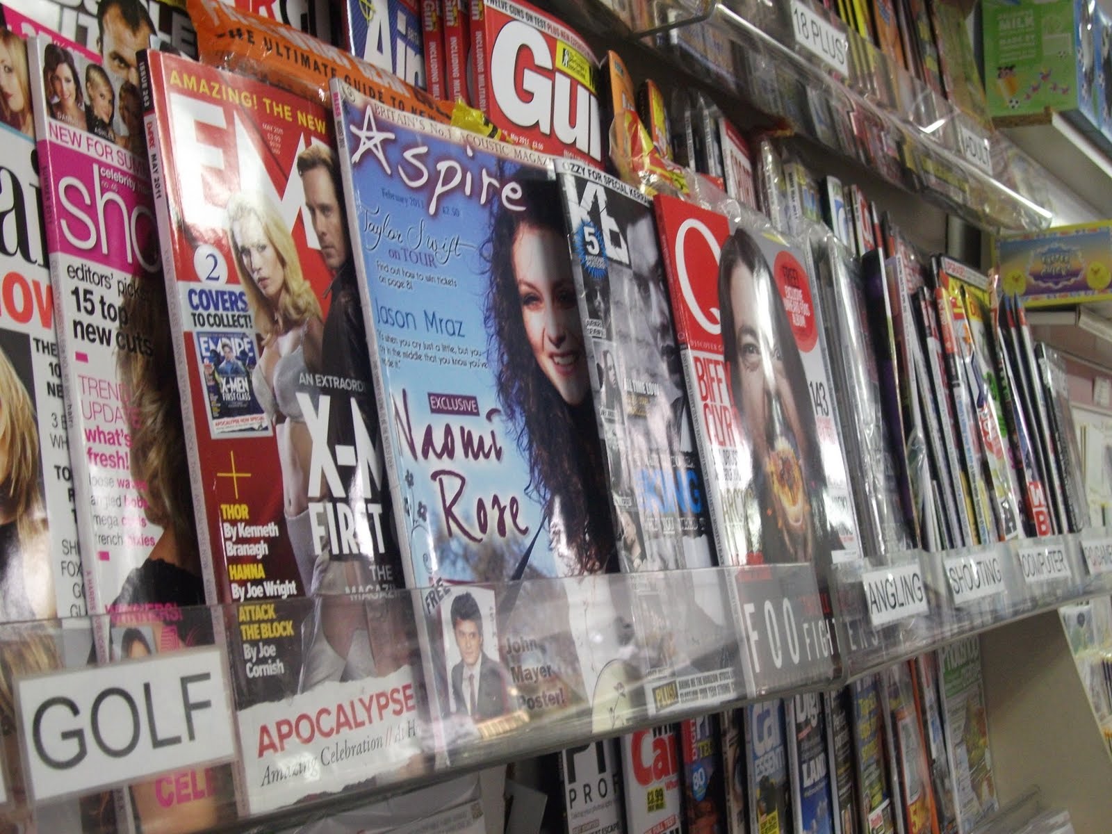
My product placement allowed me to compare my magazine with similar products and test its marketability. I found this useful because I was able to tell whether or not the conventions I’d used stood out enough to make people want to read it. I felt that the magazine visually looked good amongst other magazines and I’m very pleased with the final product. 

Front Cover

(Click on photo to see tags)

Contents Page

(Click on photo to see tags)

Double Page Spread

(Click on photo to see tags)

In what ways does your media product use, develop or challenge forms and conventions of real media products?

I decided to use the basic conventions of a magazine rather than challenge them considering my magazine is un established. However, because acoustic music is a fairly niche genre (when doing research, I struggled to find many acoustic magazines), I felt that I could be creative and add details such as the flower pattern, that you wouldn’t normally see in any other music magazine. 

I found the deconstructions of existing magazines very useful, as I was able to take into account the conventions that work, and those that don’t. It made me realise that in order to have a successful magazine, I needed to follow the essential conventions that people recognise. When evaluating my deconstructions, I established that a plain background, clear text and prominent image make the page simple but effective. I feel that I have incorporated all of these things into my front cover. It took many attempts to get the right image, as I knew that it was one of the most important features of a magazine. I focused on making the mise-en-scene relevant to my genre of acoustic music and took the photos outside in the sunshine, to create that relaxed vibe that the music represents. I also didn’t want to stage my shot too much, as I wanted to make it look as natural as possible. There is direct eye contact which is another convention, and also rather than posing, I am smiling in the photo, giving the magazine a light-hearted friendly feel. The blue sky in the photo acted as a good background for my text. The cover lines are the basic conventions of a magazine, so I thought appropriately about the tone I should use to attract my target audience. I made the cover lines as simple as possible, making the audience want to find out more. The editorial profile on my contents page has a chatty, familiar mode of address, which is also conventional.

The colour palette I used is an example of resonance, as not only does the purple/red colour fit in with the bracelet in the image, it is also quite feminine, connoting that the magazine is aimed at females. I’ve established the house style throughout, by using the same colours and fonts in my contents page and double page spread. I wanted to experiment with different fonts to create more variety in my magazine, so I have used a mixture of clear, simple fonts (particularly for my cover lines and double page spread) and ones that look more handwritten – for example in my editorial profile, making it look more personal. 

As I’ve already mentioned, I added a flower pattern which is new and innovative. This is part of the house style as it runs throughout my magazine. I wanted to make it look like they had been drawn on, making it seem quite personal. Flowers also connote nature and femininity, suiting the genre of music I’ve chosen and appealing to my target audience. 

I have also taken into consideration the ‘golden line’ which I recognised as an important feature when doing my earlier research. The Masthead is the top left so it is the first thing the reader is drawn to. I used two different fonts within my masthead, so that the A became a star. This is symbolic of the name of the magazine, i.e. aspiring to be a star. I used the star as my logo which became part of the house style, running throughout the magazine. The eye then follows an almost zigzag pattern from the image to the cover lines. I made ‘Naomi Rose’ a larger font so it is more attention-grabbing, as it is the exclusive feature in my magazine, luring the audience in. The bar code is in the bottom right corner, as it is the least important feature that the eye sees. However I also considered that this corner is the last thing the reader sees so I placed the web address here, making it more memorable. This reflects the direction of new media production, by making it multi-platform.

Saturday, 26 March 2011

Product Placement


In order to test my magazine's marketability, I placed my front cover amongst other music magazines. For my magazine to be successful, it had to stand out to lure readers in. I think my magazine cover is eye catching, particularly because of the bold blue background colour and the creative fonts. My magazine has a unique house style which also makes it attention grabbing. The 'free' poster is bold enough to capture the audience's attention, acting as a successful lure. Overall, I'm pleased with how my product looks in comparison to established magazines.

Friday, 25 March 2011

Contents Page Development

When making my DPS, I used a new font that wasn't used in my Front cover or Contents page. I wanted to continue the house style so I changed the font of my editorial profile on my Contents page to the same font as the one I used in my DPS. I think this is an improvement because it looks as though it's been handwritten, which makes the editorial profile seem more personal.

Double Page Spread

For my double page spread, I made sure I used the same fonts and colours to show a sense of house style. Additionally, I also included the flowers from the Front page and Contents to keep the style the same. I decided to change my original idea of having a quote as the heading, because the name of the star (Naomi Rose) stood out more. Instead, I enlarged a quote from the text which acts as an enigmatic lure, making people want to read on. I've used the typical conventions of a magazine, by having three columns of text and I'm also pleased with my image, as I think the mise-en-scene fits in well with my acoustic genre. In the top right corner, I have included a banner with the artist's Myspace address, as this would promote their music online, making the magazine multi-platform. Overall I'm happy with how this looks.

Wednesday, 9 March 2011

Researching Interviews for DPS

I thought I would research various interviews with artists within my genre to find out the sort of things they would say and the tone of the language used. This will help me when writing the article for my DPS. I came across a few interviews that really interested me including:

Friday, 18 February 2011

Front Cover/ Contents Page - First Drafts

I've uploaded a few versions of my front cover to show its development/ progression...

Front Cover 1
 To make the front page more similar to the contents page, I changed the style of the banner at the top so that it was the same as the contents page background. I also moved the website address onto the guitar because it shows up clearer.
Front Cover 2
I then added some flowers, which are included on the contents page, so they both look alike. I'm happy with how this looks at the moment, but feel further changes may need to be made before I'm completely satisfied with the finished product.
Front Cover 3
And here's my contents page first draft. Again, I've uploaded more than one version so you can see the progress I made.
Contents page 1
I changed the colour of the 'contents' heading so it was more similar to the front cover. Likewise, I used the same fonts and colour scheme as the front cover. I've also included the logo of the 'A' in 'Aspire' in the bottom right hand corner. I moved this from the left because I thought it looked better where it is now! I removed the stool from the original image to make room for the text which I think works well. I've added a glow to the thumbnail pictures which I've done on the front cover too so overall there is a clear house style running through the magazine.
Contents page 2